
Healthwise, Inc
Design System
Increasing design efficiency and consistency by 95% with unified design principles, patterns, and components.
MY ROLE
Product Designer
TEAM
1 Principal Product Designer
1 Senior Product Designer
TOOLS
Figma
Adobe XD
Zeroheight
Mural
Microsoft Teams
TIMELINE
1 year
My goal –
Develop and implement a design system to ensure visual uniformity across all products.
Organizations are increasingly recognizing the value of design systems.
Why are design systems important?
Increased Efficiency – Designers can accelerate their creative process by leveraging existing elements, eliminating the need for redundant work. This fosters a common language within the design team, preventing repetitive problem-solving.
Establishes Familiarity – Consistent design creates a sense of familiarity. Customers easily identify when they are within your brand’s ecosystem, reinforcing trust and reliability.
Accelerated Accessibility Implementation – Leveraging existing components with proven accessibility features expedites the design and development cycle. This collaborative effort ensures consistent adherence to accessibility standards.
Bottom line: Design systems boost productivity and cost-effectiveness for companies and their teams by eliminating redundancy and streamlining processes as products grow.
Healthwise undertook a strategic initiative to modernize its platform architecture, ushering in substantial enhancements to its suite of products and solutions. Simultaneously, the design team faced personnel changes and growth, leading to a rapid divergence in design approaches.
Our design director advocated for the development of a design system within the team. As our brand and solutions expanded rapidly, Material Design no longer sufficed, leading our engineers to continuously modify components—a situation that undermined the efficiency goals associated with Material Design.
The crux of the matter was this: How do we set a design system in motion?
Pain Points
-
Accessibility
Certain Material Design components required additional work due to AA accessibility gaps.
-
Lack of engineering buy-in
Due to a lack of prioritization by development teams, earlier design system initiatives faced consistent setbacks.
-
Adobe XD
Our design software lacked integration and collaborative capabilities that could adapt to our growing needs.
Some designers questioned the novelty of this effort compared to past attempts. While a unified approach felt promising, would it matter if our tech counterparts dismissed it?
My Drive for Uniformity
As a newer team member, I empathized with historical challenges. Despite lacking design patterns, I aimed for greater consistency within our team.
Shift to Figma
Transitioning from Adobe XD to Figma streamlined our process. I demonstrated how Figma’s design system integration could benefit us.
Pushback and Clarity
Skepticism about new tools faded when we observed Figma’s superior handling of design systems. A unified approach became more feasible.
How we went about it
Workshop Kickoff
Our onsite session involved UX research counterparts. Guided by our design strategist, we collectively crafted a manifesto to guide us.
Visual Disparities
Designers printed key product screenshots and organized them by components (e.g., search bars, modals). This revealed disparities across our products.
Balancing Workload
Despite the challenge of simultaneously building new products, we recognized the benefits of uniformity. Designers met weekly to address active components or patterns.


The Search Bar
Unified Approach
While developing multiple products with search experiences, we prioritized the search bar as the initial component for our design system.
We researched preferred experiences, accessibility requirements, and evaluated existing components in our products.
Flexible Search Bar
Recognizing the need for flexibility, we tailored the search bar to accommodate various products and user personas.
Usability Testing
Simultaneously building new products allowed us to test component usability alongside product designs.
Sequential Approach
We tackled complex components first, which naturally influenced basic components and patterns.

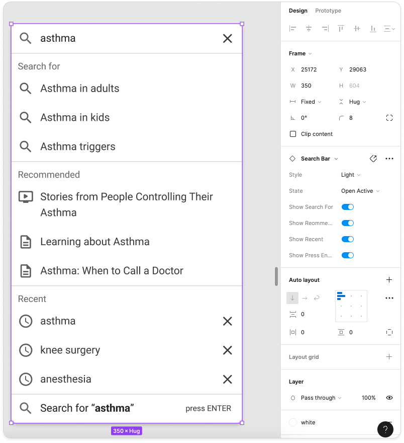
From whiteboard to Figma, we componentized a search bar and typeahead with customizable options that work across our personas and products.

An example of a virtual collaboration session. Here, we are taking inventory of the fonts, sizing, weight, spacing, and more across all of our applications.

Our neutral color palette was admittedly getting out of hand. We were able to consolidate our grays down a set that provided room for accessibility and creativity.

Component progress underway: a content card for search results, text fields, and a past date picker (which differed from our current date picker).

Componentizing states
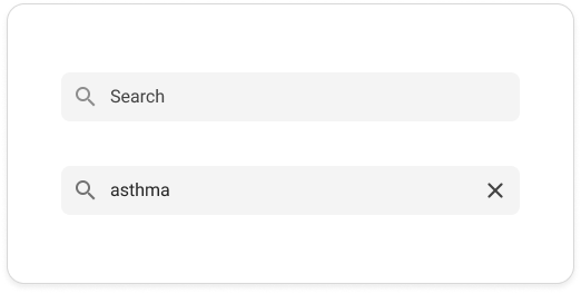
Updates to our search bar were small, but mighty: moving the magnifying glass from the right to the left provided visual scent, which also addressed the strange switch from magnifying glass to close icon when a user activated the search field.
Documentation
Component Creation: After selecting a component, one designer would create it. We’d then test its durability and quality in our designs.
Iterative Refinement: Weekly meetings allowed us to tweak components as needed and address any bugs.
Documentation Effort: When satisfied with a component, another designer documented it in our style guide using Zeroheight with Figma.
Unexpected Enjoyment: Surprisingly, I found documenting the process enjoyable. Chat-GPT helped me create clear, concise descriptions for component details, use cases, and guidelines.
Finding Inspiration
I explored successful design systems in the wild that were working well, such as Gestalt by Pinterest, Carbon Design System, and Garden by Zendesk.
In addition, books like Design That Scales: Creating a Sustainable Design System Practice and Smashing Magazine’s Design Systems guided our process.
I also found myself in endless YouTube rabbit holes gathering a wealth of knowledge from design system advocates like Dan Mall.

Ship it
Design systems typically save about tens of thousands of hours* and our design team unanimously felt the efficiency boost from our design system during wireframing. The team also appreciated the newfound alignment and consistency across applications.
* Source: Dan Mall
Our united effort resonated with Product Managers. Although they had a general sense of the project, they keenly observed the changes as they unfolded across our applications.
-

Our new design system (!!)
-

A product built with our new design system
Major Learnings
Our design team transformed—no more silos. We dove into each other’s work, embracing vulnerability and discomfort. We fostered a safe space for learning and admitting when we didn’t know something.
As we progressed, we discovered each designer’s strengths: some excelled in Figma component building, while others focused on accessibility research. I leaned into documentation, and together, we unified both our designs and our team.
This entire process was new to me, a growth opportunity as we navigated collaboration, diverse personalities, and new tools.
Getting Developer Buy-in
Our focus was on unifying designs, not immediate developer buy-in. Although we haven’t fully achieved it yet, our collaboration with a lead front-end engineer has been promising. Regular reviews, suggestions, and shared documentation have sparked interest and created a single source of truth for front-end developers.
Our design system is an ongoing journey. Despite feeling like we’ve just scratched the surface, reflecting on our progress is rewarding. We’ve established a process that previously eluded us. While more components and patterns await, our time-saving approach persists.
Moving forward
Up Next: