
Healthwise, Inc
Reporting and Analytics
Empowering medical facilities with a comprehensive data platform surfacing patient education metrics and clinician insights.
MY ROLE
Product Designer
TEAM
2 Product Managers
2 Full-stack Developers
2 Data Engineers
1 Content Strategist
1 UX Researcher
TOOLS
Figma
PowerBI
Jira
Mural
Microsoft Teams
TIMELINE
14 weeks for research + design
2 weeks for development
How designing transparent data visualizations improved ROI
This case study explores how I leveraged client interviews, internal research, and cross-team collaboration to surface data in a product environment.
Before this solution, usage metrics were extremely limited and clients were unable to track the direct impact our products and services had on their patients and providers.
By creating the Reporting and Analytics app, our clients and their respective educators gained access usage data, aiding informed business and medical decisions to improve their patient outcomes.
My goal –
Design a data-driven experience that showcases our products’ impact on efficiency and patient outcomes.
Clients wanted to ensure their clinicians were efficiently providing education to patients and that initiatives were being met.
Internal account managers were over-burdened with reviewing client data. Clients needed to be able to self-serve.
Limited technical partnerships meant our available data-set would not portray the “whole” picture.
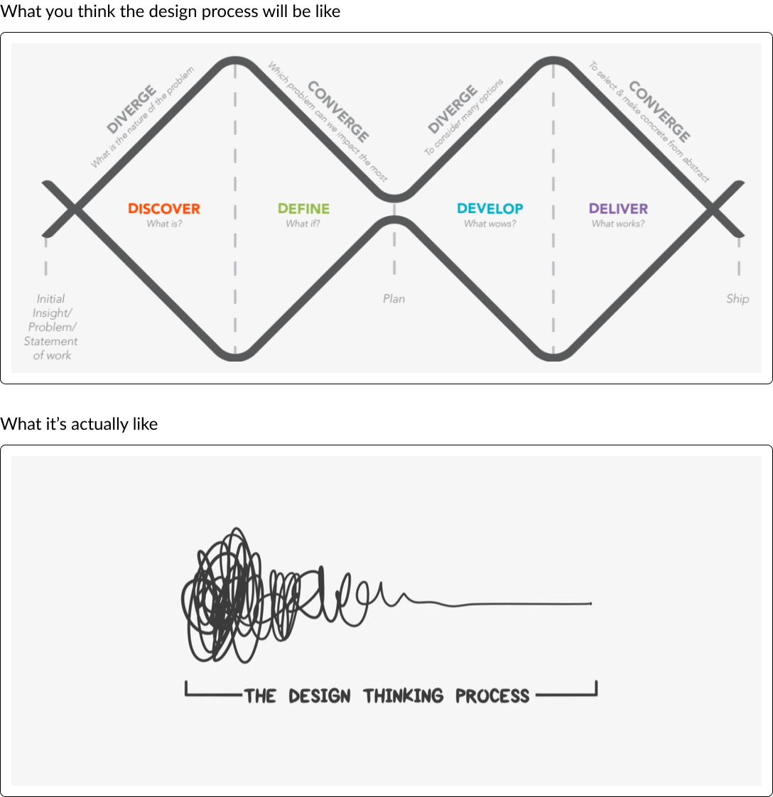
How we went about it
Working under a compressed timeline means that design and research happen in parallel. It’s like trying to paint a still life that’s slowly revealing itself while you’re working.
“The hope would be for increased education and overall more efficient use of it, be able to track that and monitor which groups have room for improvement.”
— Anonymous Client
Research
Gathered internal feedback for each iteration of the wireframes.
Conducted research calls with 4 large client organizations throughout the process, getting feedback at each stage of the wireframes.
Tech Limitations
Frequently worked with engineering to understand data limitations. We needed to ensure full transparency in how our data was being collected, which meant providing plain language definitions for visualizations was critical.
Reviewed wireframes with tech teams to ensure data feasibility.

Feedback gathering from stakeholders on early wireframes
-

Plain language definitions promote transparency and accuracy.
-

Early wireframes based on internal research and feedback.
-
A later wireframe edition after client interviews.
We officially shipped our MVP and GA clients are being onboarded. Although our team is eagerly awaiting feedback, this product has already resulted in ROI wins for our team. Here’s how:
Product Impact: Clients can easily see the impact our products have on their organization. They can also quickly address areas of improvement for greater patient outcomes.
Streamlined Workflow: Clients can quickly and easily access their analytics through their Healthwise applications dashboard. Yay for self-serve!
Increased Efficiency: Account Managers no longer need to spend time walking each client through this data on a quarterly basis, resulting in a huge time savings!

Ship it
Major Learnings

PowerBI: PowerBI is a back-end tool that our Data Engineers love, but it was tricky to design for. I dove head-first into learning the best ways to design for PowerBI in addition to leveraging relationships and workshop sessions with my Data Engineering partners.
Transparency is the Key to Trust: Our interviews highlighted the necessity for easy-to-understand definitions so that users know exactly what they’re looking at and where the data is coming from. Simply showing data does not provide enough context.
Data Visualization: With no prior experience in data, I learned a tremendous amount about how to convey complex insights effectively. I now appreciate the power of visual narratives and their ability to bridge the gap between raw data and meaningful insights.
Pooling Data Talent: Within our organization, data professionals worked across different domains. As the project unfolded, we realized that integrating their expertise was a game-changer. Their ability to decipher client preferences and enhance our PowerBI workflows significantly impacted our project’s success. I only wish we had combined forces earlier!
Up Next: