Healthwise, Inc
Content Management Experience
Optimizing search and findability for clinical educators so they can empower patients and improve their health journey.
MY ROLE
Product Designer
TEAM
2 Product Managers
5 Full-stack Developers
2 Knowledge Engineers
1 Content Strategist
1 UX Researcher
TOOLS
Figma
Jira
Mural
Microsoft Teams
TIMELINE
12 weeks for research + design
16 weeks for development
My goal –
Provide clients with access to all of their content in a single, centralized experience.
Healthwise provides evidence-based patient education and software. Our offerings span point-of-care education, knowledgebase compilation for patient portals and websites, and structured content for payers and providers.
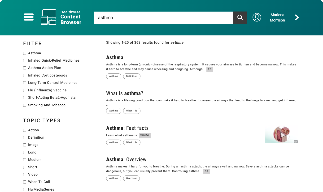
Despite our high-quality content, content discovery has been a challenge. Historically, we maintained separate applications for different content types.
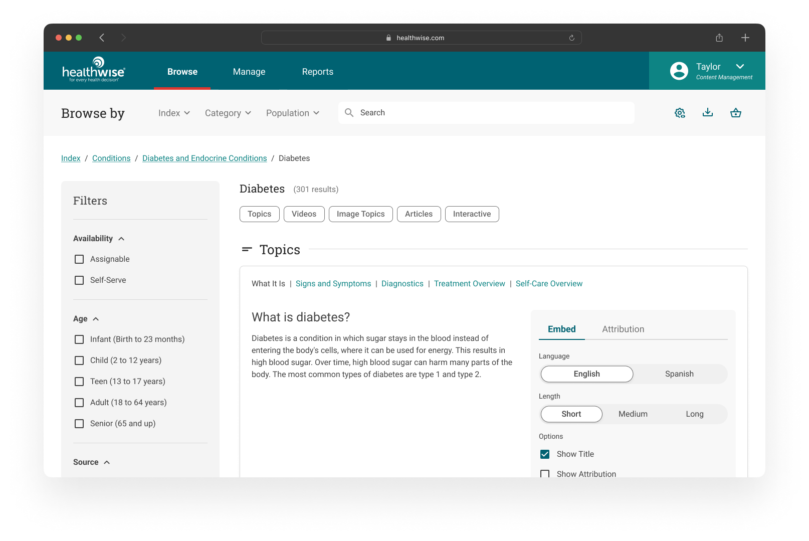
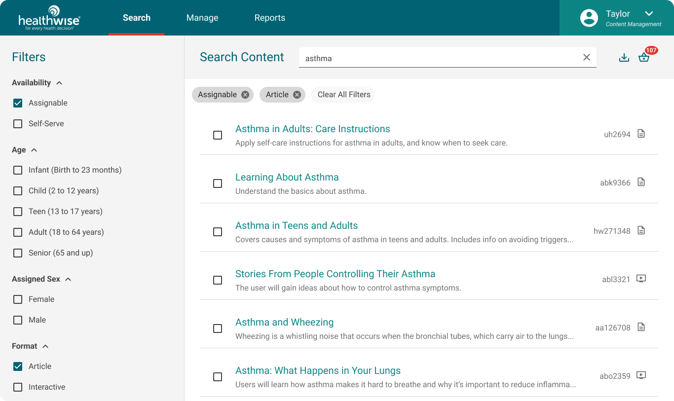
As part of our platform modernization, we revamped our Content Management application to create a unified, user-friendly experience.
Below you can see some of the disparate internal and external-facing tools being used for finding Healthwise content at the start of this project.
How we went about it
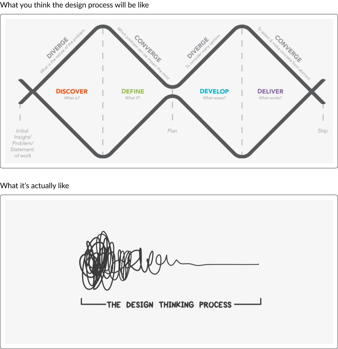
Working under a compressed timeline means that design and research happen in parallel. It’s like trying to paint a still life that’s slowly revealing itself while you’re working.
Research-ish
We tapped into internal roles to gather insights on client pain points, market demands, and key personas.
Armed with this data, my UX research partner and I created user journey maps and developed persona details. While many questions remained unanswered, we laid the groundwork for formulating hypotheses.
Pain Points
-
Content located in different repositories
Content is spread out across multiple applications. Clients want a centralized experience; they want all of their content in one place.
-
Too much curation
An abundance of similar search results can be overwhelming. Clients want to do less curation and receive consistent results.
-
Results are not sorted by relevance
Relevant results save time and effort. Users can quickly find the information they need without sifting through irrelevant content.
Many Jobs to be Done
We catered to diverse personas throughout healthcare. Each had distinct tasks and varying clinical expertise.
Early sketches and ideas
A Lesson in Ontology
I sought out guidance from our content strategists and knowledge engineers to learn our taxonomy. Their patient mentoring helped me navigate the intricacies of content organization, terminology, and ontology.
Designing + Validating
Armed with internal research, I constructed initial lo-fi concepts. Grouping similar formats for quick scanning was essential.
During the second version of wireframe development, I collaborated with Content Strategy and Knowledge Engineering. Our goal: enable users to both search by keyword and browse content.
We recognized distinct browsing preferences: some preferred casual browsing under broad topics, while others sought specific information.
Given our extensive taxonomy and diverse user mix, understanding content discovery preferences posed a challenge.
Persuading the Outliers
Despite some internal stakeholders advocating for a dual search experience within a single application, our research indicated otherwise.
I created a wireframe illustrating that such similarity would burden users. They’d struggle to locate content, akin to the existing experience. While this seemed to convince the skeptical stakeholders, they were still reeling with understanding how we would do this.
Client Interviews
My research partner and I conducted client interviews with the wireframes. We refined user journey maps and personas during these sessions.
Despite challenges (interviewing buyers and decision-makers rather than end users), I iterated on wireframes weekly, incorporating high-fidelity components.
User Testing
It had historically been difficult for us to find the right audience to test this product with on usertesting.com and this time proved no different. We received fairly inconclusive data on browsing behavior (tweaking the test a few times), though we did refined our menu terminology, switching from “Taxonomy” to a more user-friendly term “Index.”
With limited client time, we made informed decisions for the MVP release, planning to refine search and gather feedback during the GA stage.
Engineering Buy-In
I engaged our development team, looking to get ahead of any technical constraints and sharing insights from interviews and user journey maps. Their understanding was crucial for successful implementation.
Hi-Fi Designs
While I worked on the Content Management Experience, a fellow designer focused on a patient-facing app with similar content search needs. We created flexible components from our design patterns, leveraging each other’s usability testing. We improved our components and expanded the design system.
Roadblocks
Roadmaps for the Knowledge Engineering and content teams changed frequently, requiring us to accommodate an uneven taxonomy in our interface. Despite these fluctuations, we remained agile in our MVP stage with the knowledge that we can continue to address issues in future product iterations.
-

Relevant results for very broad search terms, with the option to traverse deeper into our content.
-

Menus leverage our taxonomy branches and ontological groupings prepared by our Knowledge Engineering team.
-

Less curation, with an emphasis on consistent results.
Ship it
Feb 26, 2024 we officially shipped our MVP. We were able to merge all of our content into a single search & browse experience! Our GA clients are being onboarded and our team is eagerly awaiting feedback.
Major Learnings
While we could always have spent more time researching, testing, and iterating, the most valuable feedback comes from the product users. Moving the product to the GA stage allowed us to gather insights from the right audience, not just decision-makers or interviewees.
Despite the initial project scope feeling massive, collaboration across teams made it feasible. We discovered each other’s strengths and leveraged skills beyond our roles. Interestingly, once-skeptical stakeholders became enthusiastic product demoers!
Moving forward
Client Feedback: I am eagerly awaiting feedback from clients during our GA phase, which I hope will offer insights into browsing behavior.
Internal Testing: We’re actively conducting internal search and findability tests across teams to ensure relevant search results are presented in a user-friendly order.
Content Enhancement: As our Knowledge Engineering and content teams add new content, I’m excited to improve our taxonomy and create a consistent user experience.
Up Next:


